Under the covers... Elvis Costello Armed Forces Page 2

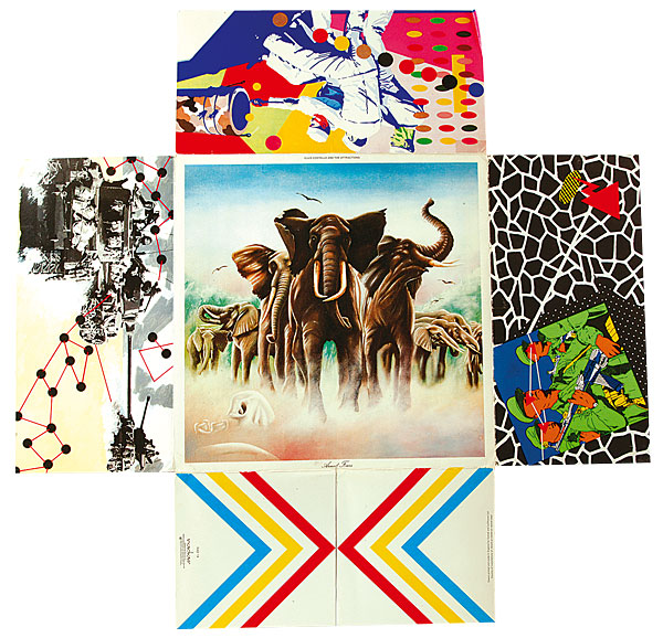
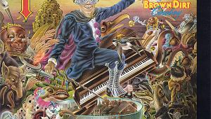
Elvis's matter-of-fact description given in his 2015 autobiography Unfaithful Music & Disappearing Ink hardly does justice to its full glory: 'It [the album] came wrapped in a folding envelope of Barney Bubbles' pop art design: a kitsch painting of stampeding elephants, Jackson Pollock and David Hockney quotations, a cartoon of Red Army soldiers with laser-beam eyes, animal prints, and a photograph of us standing under a monkey puzzle tree in the driveway of a palatial house on the Wirral'.
Colour Scheme
The front cover image of the elephants was not actually painted by Bubbles himself but by Tom Pogson, in an Athena-style imitation of famed, elephant-loving wildlife artist David Shepherd. The choice of this image, which you might otherwise have expected to see adorning the dining room of an aspirational suburban '70s home, was a typically oblique gag on Bubbles' part, telling us pretty much nothing about what to expect from the record it housed.
And once you delved further in, the plot thickened to reveal multiple layers of intrigue. An image of marching Chinese soldiers is juxtaposed with Jackson Pollock-style abstract artworks and gaudy tigerskin print, some created by French punk art collective Bazooka. On either side of the inner sleeve the central photos are surrounded by tabs arranged like a selection of colours one might be presented to choose from in a DIY store. Their names ('Symphony green', 'Hydrangea blue', and indeed 'Black black' among them) sound conservative in the age of Farrow & Ball, but the gag is surely in the fact that the tabs are all yellow on one side, red on the other.
A comment on the homogeneity of every dream home? Or indeed the heartaches therein? The band photos on the same panels suggest so. On one side, under the words 'Our place …' we see a horizontal, suited-and-booted Costello dangling surreally over a rubber ring in a swimming pool, with only one toe of his boot balanced on the edge. On the other side, under '…Or yours', is the shot of the band posing outside the aforementioned Wirral domicile. Your guess is as good as ours.
On The House
Elvis has since revealed that the latter snap proved the costliest image in the whole package, as the photograph of the property was taken without permission and the owners had to be paid so as to avoid legal action.

The package was better value for money for the punter who, for around £3.99, could buy themselves hours of fun rearranging the order of the foldout sleeves to please their mood or aesthetic preferences.
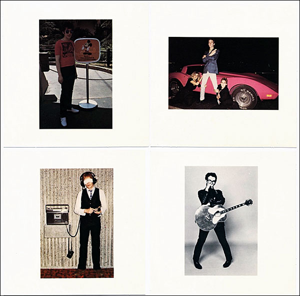
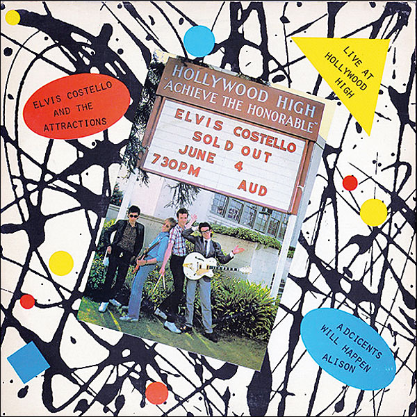
Stiff's penchant for promotional overkill had clearly infected Radar records, as free gifts were also included in the early packages, including a live EP recorded at Hollywood High School and a single of Elvis's favourite song from the sessions, 'Talking In The Dark'. Finally, postcard photos of The Attractions were an artful coup de grace.
In the end, the only concession the cover made to the forces of conservatism concerned the name on it. Plans to call the LP 'Emotional Fascism' were scrapped when Elvis accepted this would hardly encourage DJs, particularly those in the US, to play the album's songs on the radio.
While for years the kind of inventive, original sleeve art found in Armed Forces was chiefly appreciated by music fans, in time the art world would also come to acknowledge the work. Glenn Adamson, who curated the V&A museum's 2011 exhibition Postmodernism, Style and Subversion 1970-1990, included Bubbles' work, and singled out the Armed Forces sleeve as his favourite, arguing that he was very much ahead of his time in his approach to bricolage – the juxtaposition of seemingly unconnected images.
Breaking Cover
'Bubbles was creating by hand work which looks to our eyes as though it were assembled on a computer', said Adamson. 'He quoted the range of art-historical sources and ripped [them] up and pasted [them] together... The design seems endlessly creative, like he's got more ammunition to bring to it than can ever be absorbed by the object.' He then concluded: 'We say that "Postmodernism is always a little too much", and Armed Forces meets that definition'.
It seems that too much, in this case at least, proved to be just enough.
|
| |||||||||


| Equipment Reviews | Music Reviews Awards | Latest News Features | Resources Newsletters | Subscriptions |
WHERE TECHNOLOGY BECOMES ENTERTAINMENT
 © 2026 Hi-Fi News
AVTech Media Ltd
All rights reserved